Company: Disney Interactive Studios
Core Team: Joel W (Senior Software Engineer), Karen J (Producer), Scott D. (Software Engineer), Nicki S. (Web Designer) and Wynne Leung (Senior Web Designer)
Introduction
Club Penguin was a popular online MMOG (massively multiplayer online game) owned by the Walt Disney Company. The game was originally was created in Canada by New Horizon Interactive (now known as Disney Canada Inc.). Players created cartoon penguin-avatars and played in a winter-set virtual world.
Club Penguin was made available to the general public on October 24, 2005, and expanded into a large online community, such that by late 2007, it was claimed Club Penguin had over 30 million user accounts. As of July 2013, Club Penguin had over 200 million registered user accounts.
I was hired as the Senior Web Designer with the responsibility of leading Club Penguin's website redesign project. I had the experience leading and completing web redesign projects from working at Corus Entertainment for the following brands: Nickeldeon, Sundance Channel and Movie Central.
Through that experience at Corus I learned the tools and processes for a redesign through my mentors. I also learned the value of setting expectations in design. Especially when it's a redesign process that will involve many people and their production processes. I learned how to design for different CMS systems. How to test designs with developers. How to talk about difficult challenges. How to actively listen and how to share feedback. And most of all that we are all here to help each other succeed.
I took all of that with me to Club Penguin. The main web team grew from one designer to two and web development team from two to four. Through this opportunity I hired and supported a junior designer who is now a Senior Product Designer at Sprout. I feel really proud and happy that I was able to share what I've learned from my mentors to another designer.
This redesign project I thought would only take 6-8 months to complete took about 14 months. Here's how it unfolded.
Grouping Challenges
When I arrived I had to organize my energy into familiar challenges and new challenges. I knew that there was a lot of learning to take place so I wanted to prioritize my time efficiently.
Redesign Process


Sitemap
I learned after a small site-mapping exercise that the website is a shared space for the studio, which comprised of about 100 members. Because the redesign will very likely change their current work processes I wanted to take this opportunity to first take an inventory of what is currently on the site and then work with them to discuss what to take to the future and what they wanted support with.
Club Penguin - Production Teams
Membership Team - Marketing for membership
Merchandise Team - Physical merchandising and redemption process
Community Support Team - 24 hour in-game moderation for kids safety
In-Game Experience Team - In-game illustration and animation
Writers Team - In-game story telling and brand design, web community moderation and storytelling
Sound Team - In-game sound design
Mobile Team - iOS Mobile design and development
Research Team - User research
Branding Team - Brand design
Global Team - In-game and web content translation
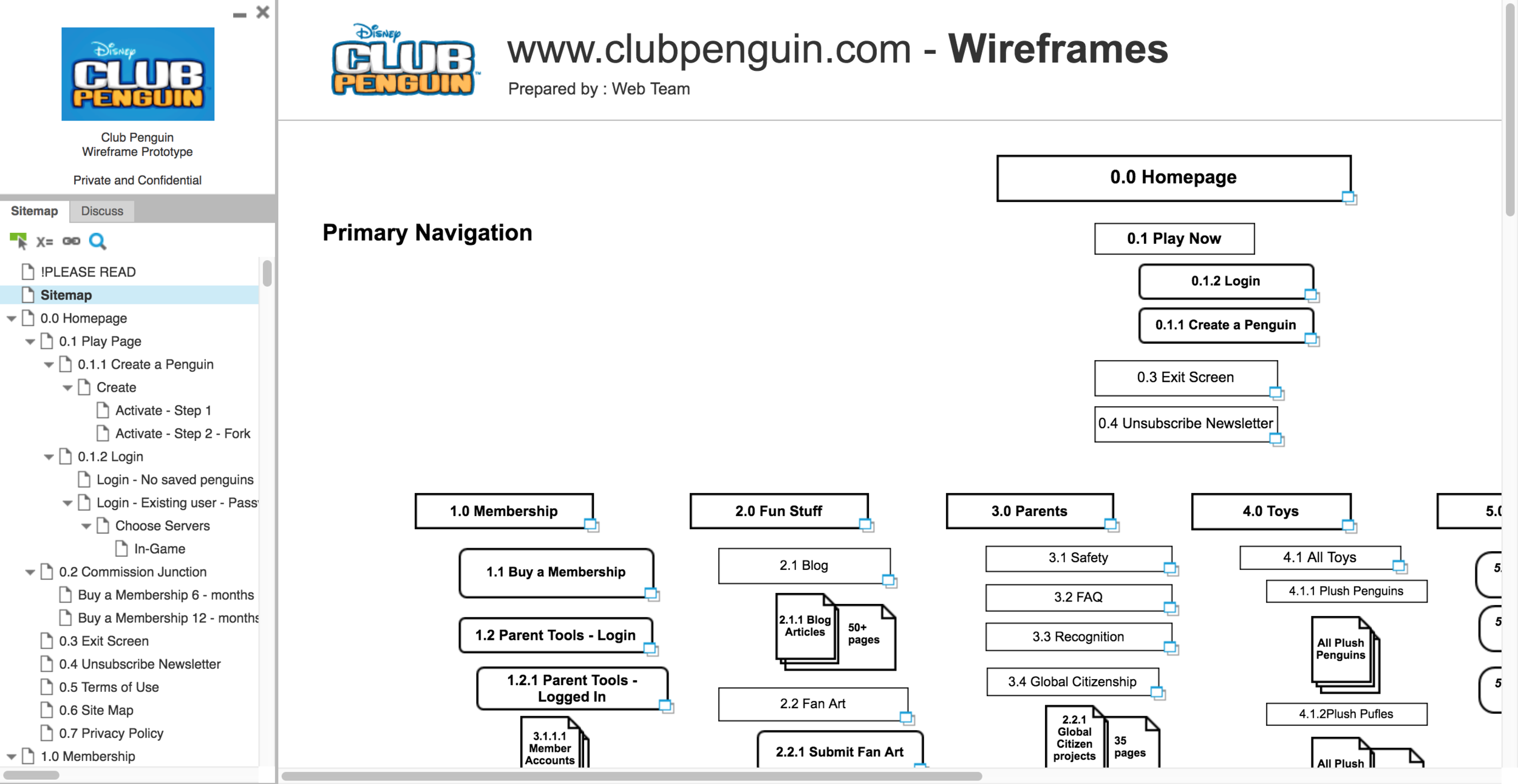
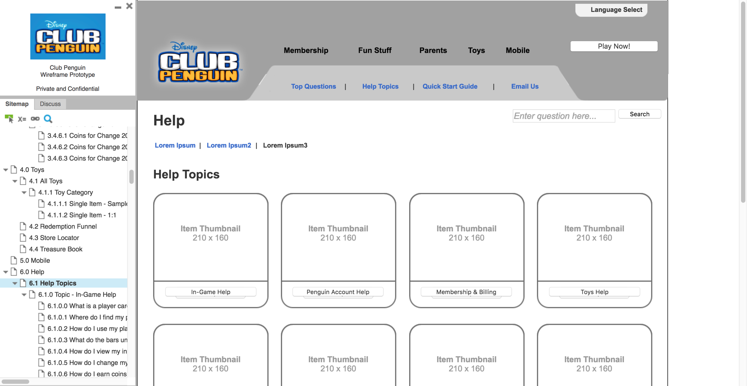
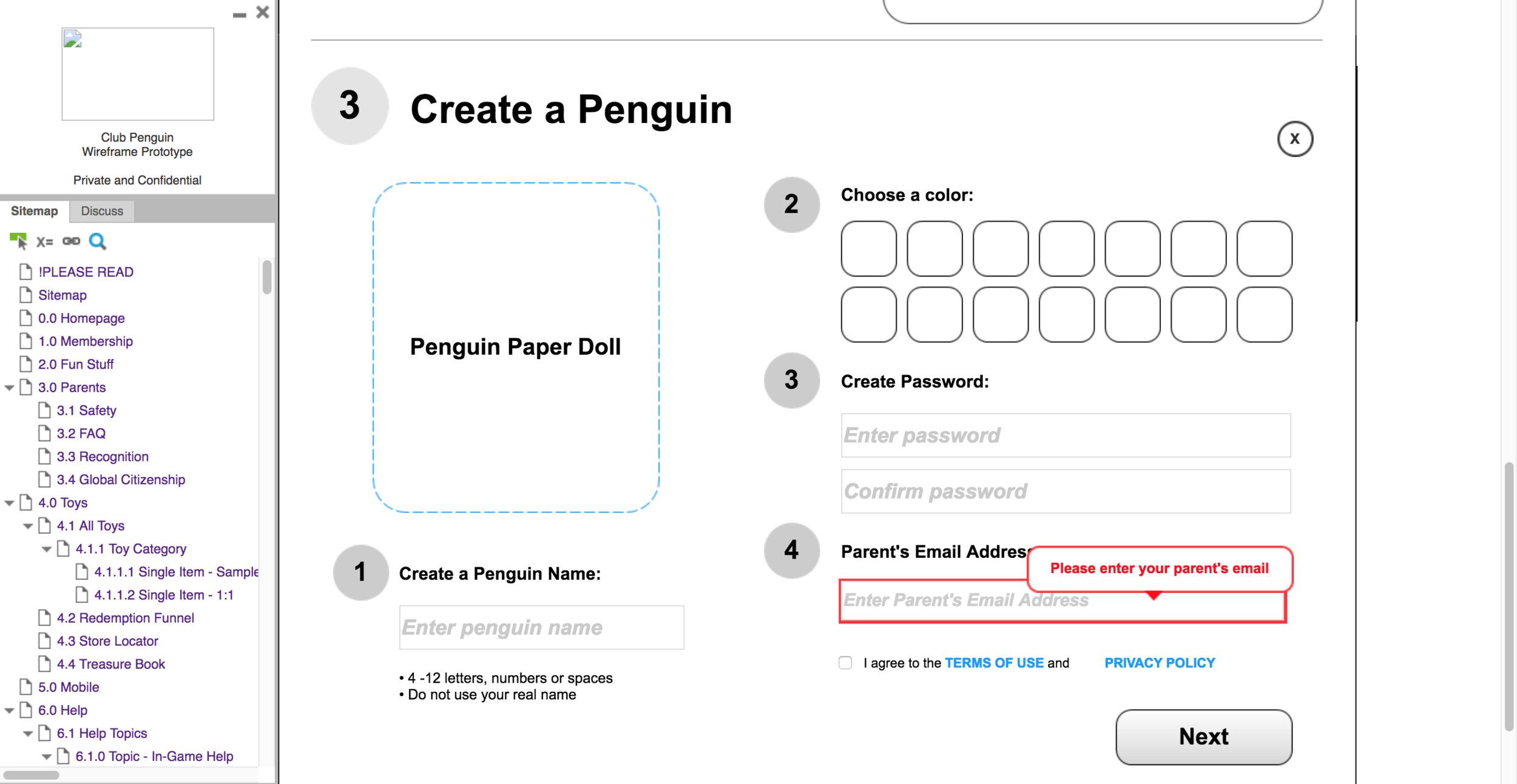
Wireframing
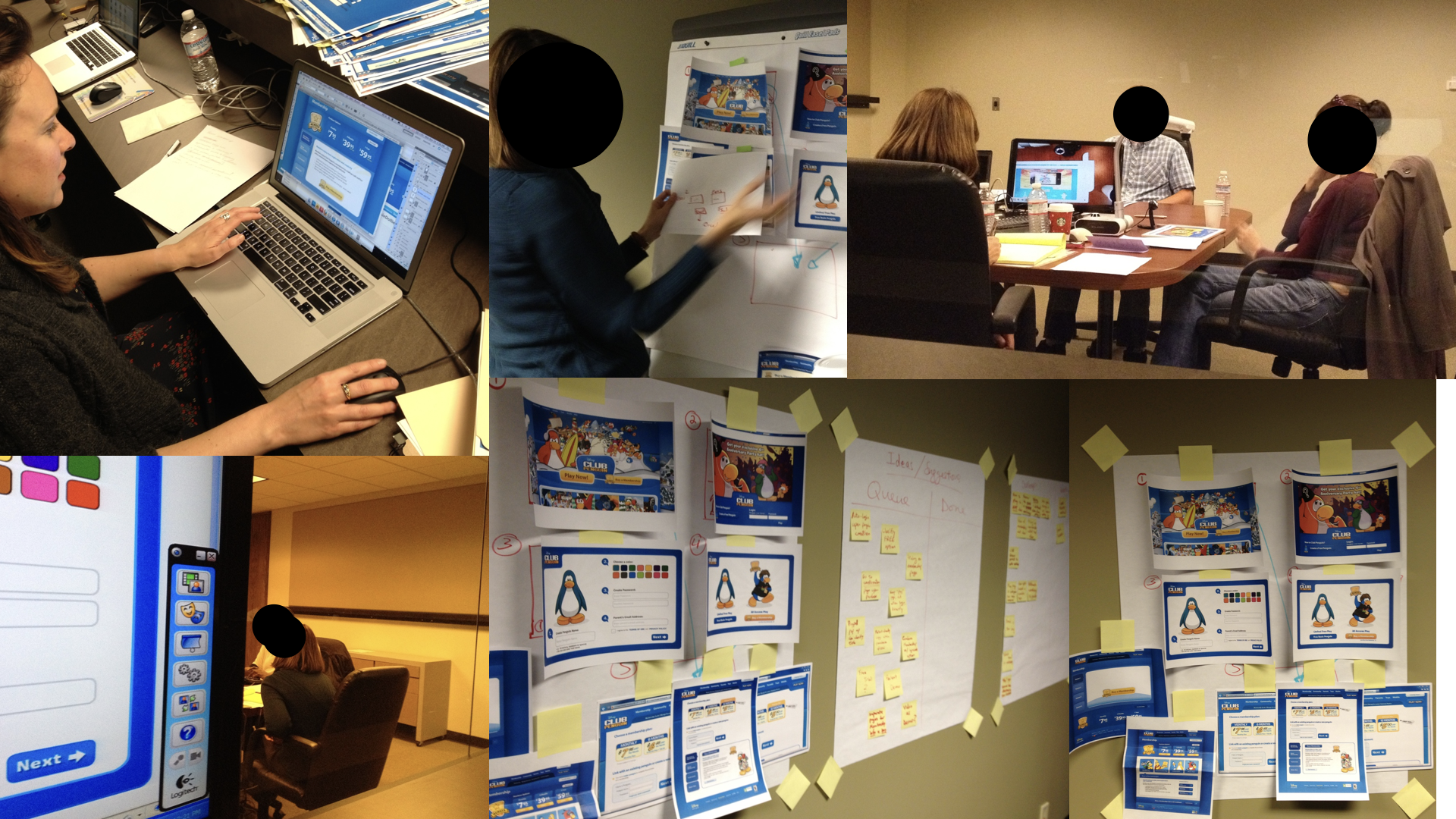
For the familiar challenges, I wanted a space where we could all reference to flows and decisions that we will be making. Therefore, I used Axure to build a clickable prototype to sitemap and wireframe each page of the site. Whatever changes were made, we were to keep this updated as we progressed.
Below are some screenshots from the clickable prototype that we were very helpful in helping us communicate our design vision in meetings with different teams, presentations and user testing sessions.
Link to full prototype on Axure: https://isfht8.axshare.com/#p=_please_read


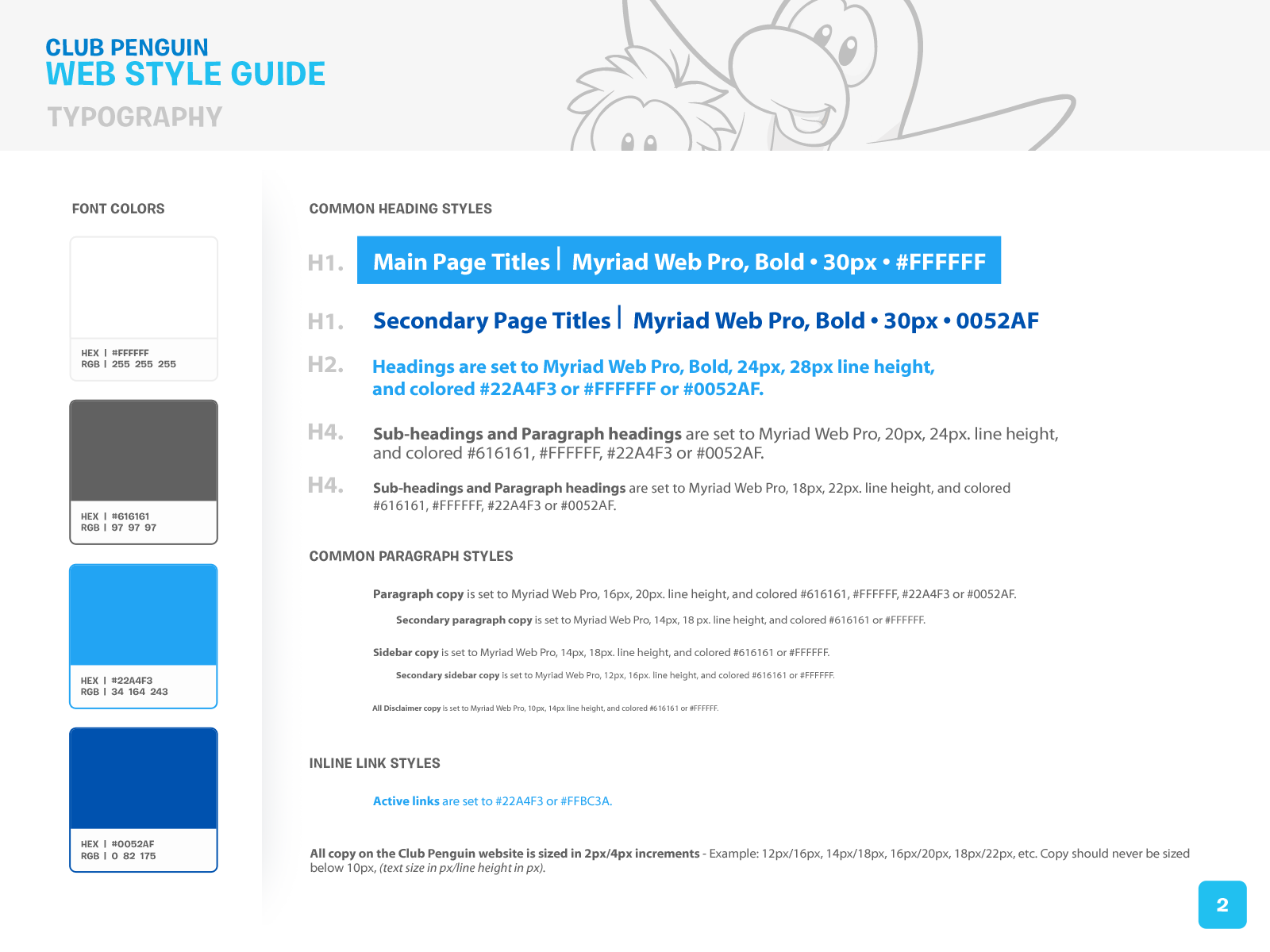
Visual Design
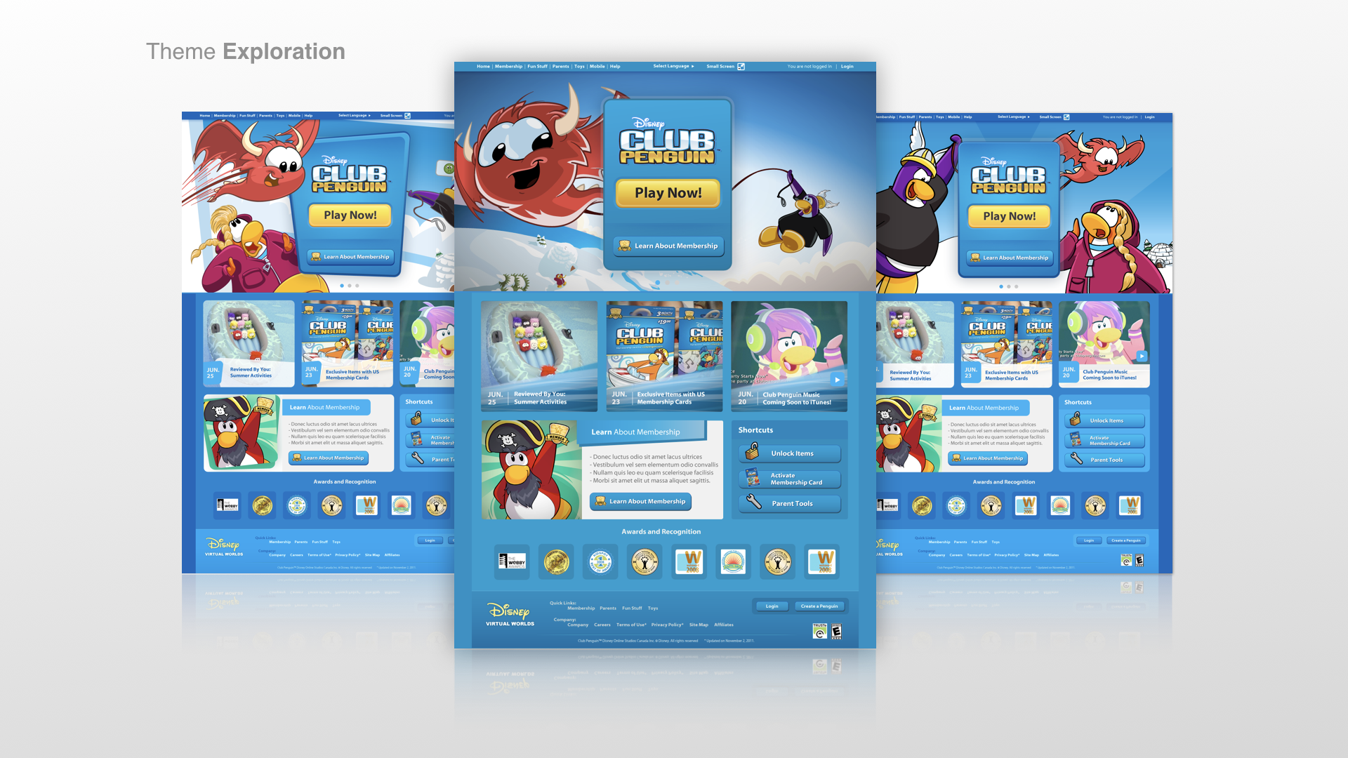
Visual Styleguide for Redesign
As we progressed through sections of the site for UX and visual design we got clearer on our visual design language. We created a template for other members of the studio to use if needed and for other designers who may need to use this design styleguide for their work in different offices.


Final Web Templates for Launch
Research with Disney Studio Insights and The Neilson Norman Group
Disney Studio Insights
Parent Tool, Redemption Funnel and The Homepage Redesign
We worked with our in-house research team for
The Parent Tool Redesign
The Redemption Funnel
The Homepage Redesign
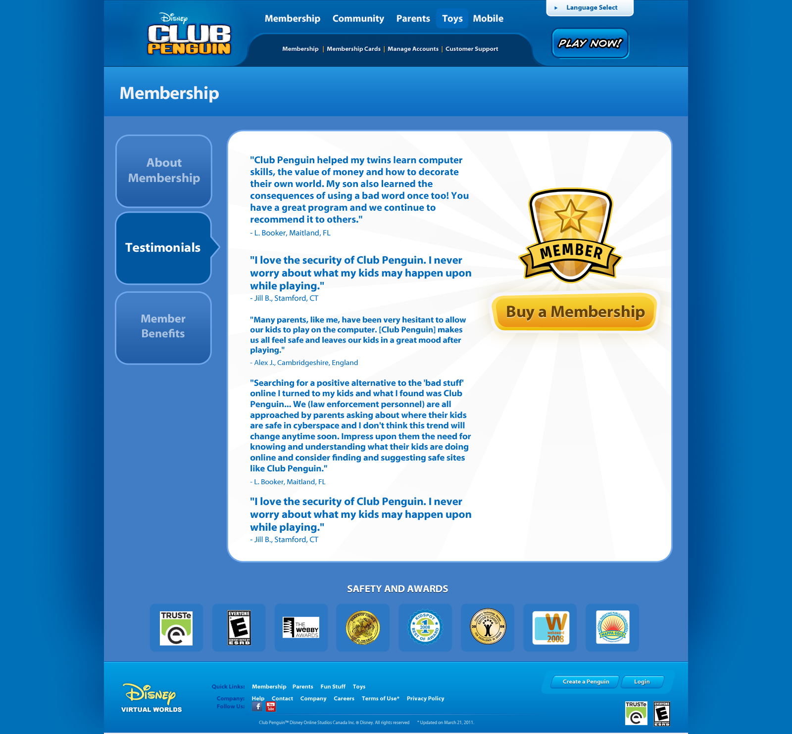
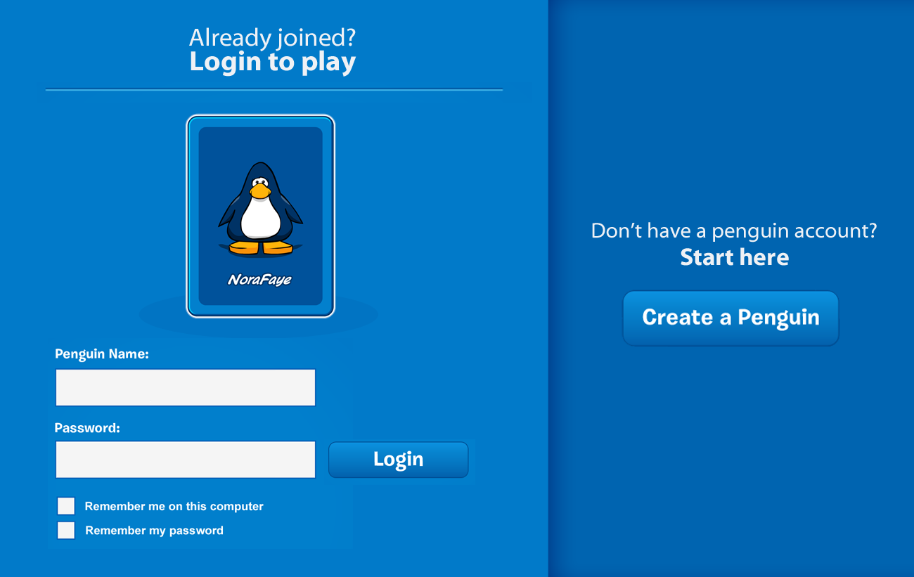
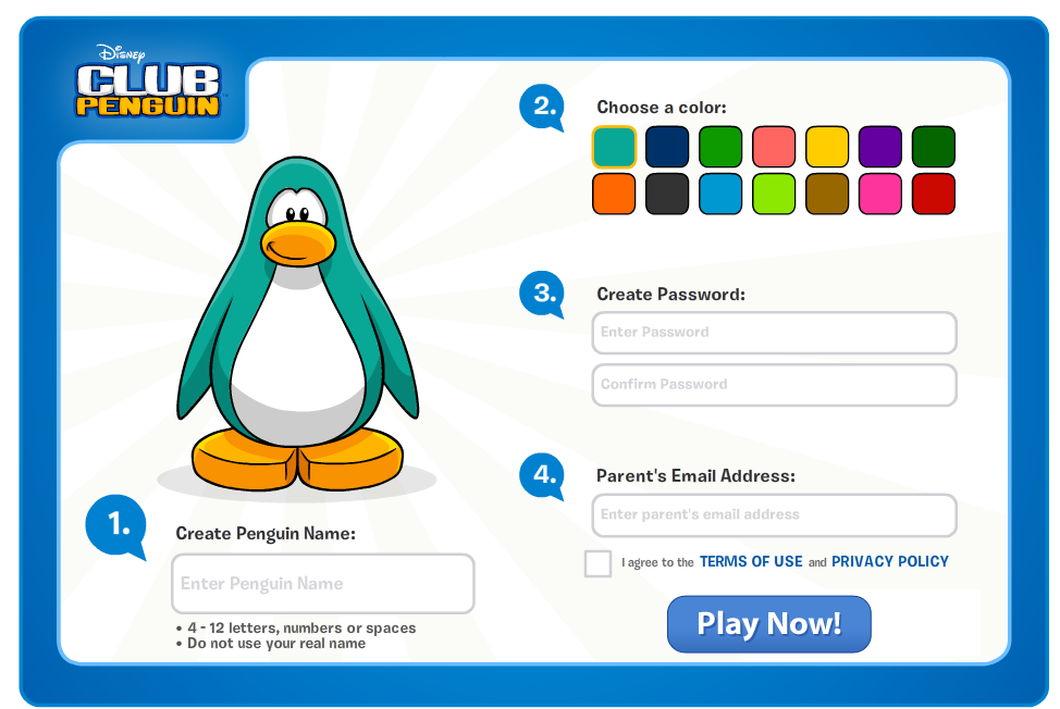
The Parent Tool Redesign
The Parent Tool is a space where parents log in to moderate their children's use of their character in game. Safety is the top concern for Club Penguin. Because of that, they can log-in to remove their children from the account at anytime. Club Penguin is a community space where children interact with each other. Moderators will report all misconduct directly to the parents and log them in their account for them to see. For monetization, since it will be the parents who have access to upgrade the child's account from a non-paid account to a paid one, we also made it easy for them to do so through the Parent Tools.
Wireframing - Parent Tools


Visual Design - Parent Tools


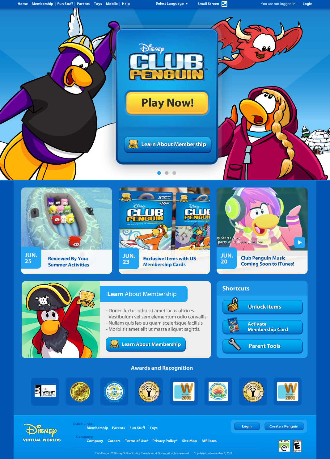
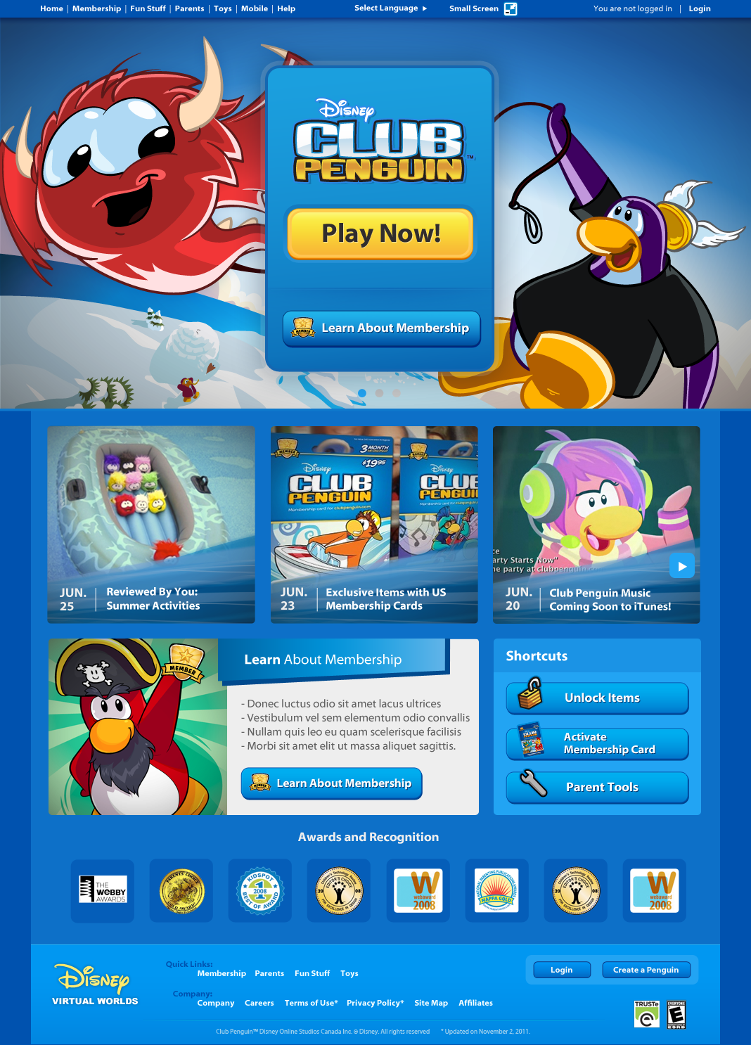
Homepage Redesign
Upon redesigning the site one of the projects we decided to tackle was one that was the most controversial because of the number of users that go to that site. Almost all of the children go directly to the homepage and log into their account from there. Stakeholders wanted to use this opportunity to connect the kids to other new products that were in development, weekly updates from the game community and an opportunity to upsell to parents.
The new products that were in development at the time were three iOS Mobile Apps that were standalone apps to promote the brand but at the time were not tied to the online world.
Experience Mapping - Homepage Redesign

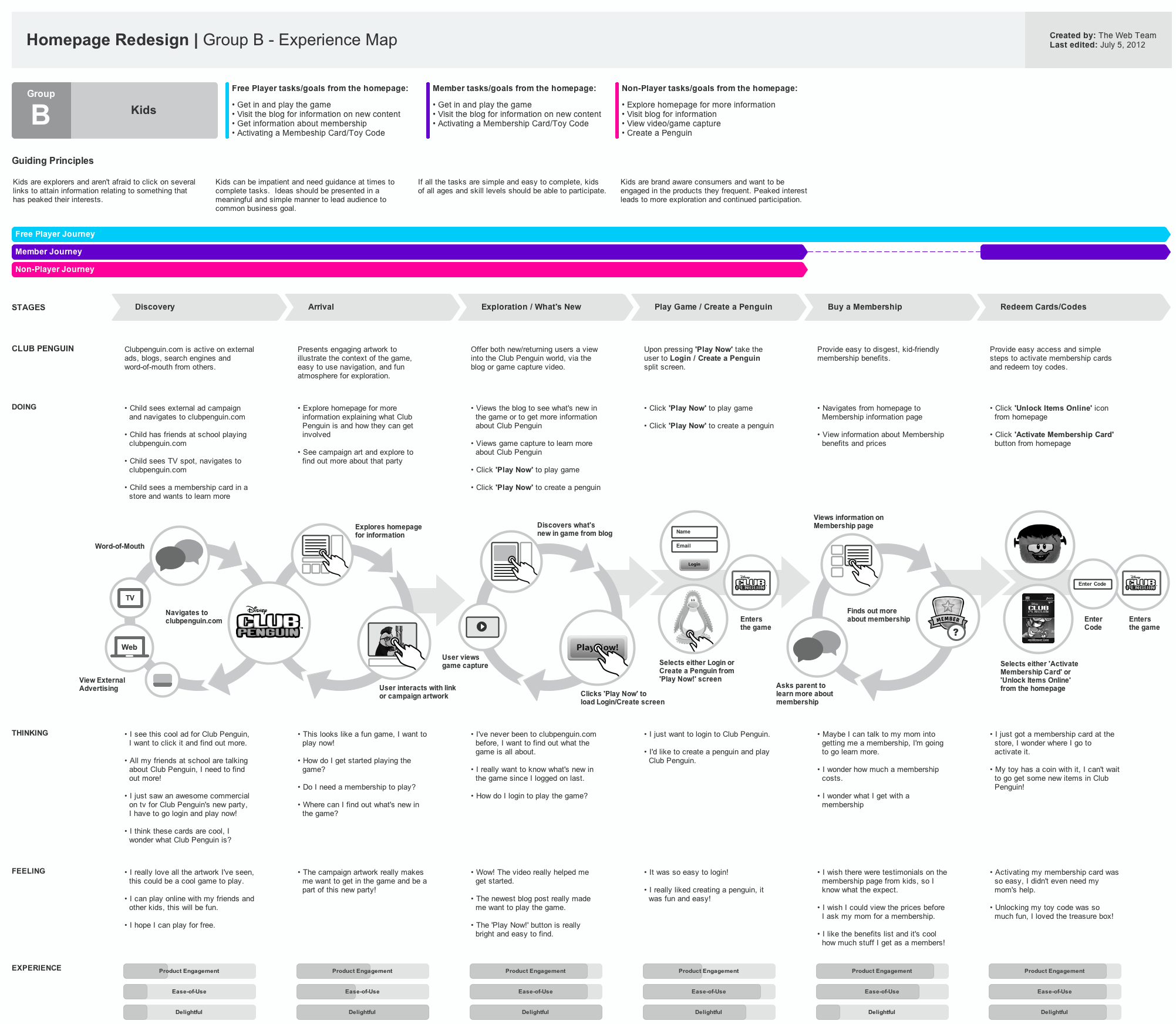
User's Connection to illustration and Story
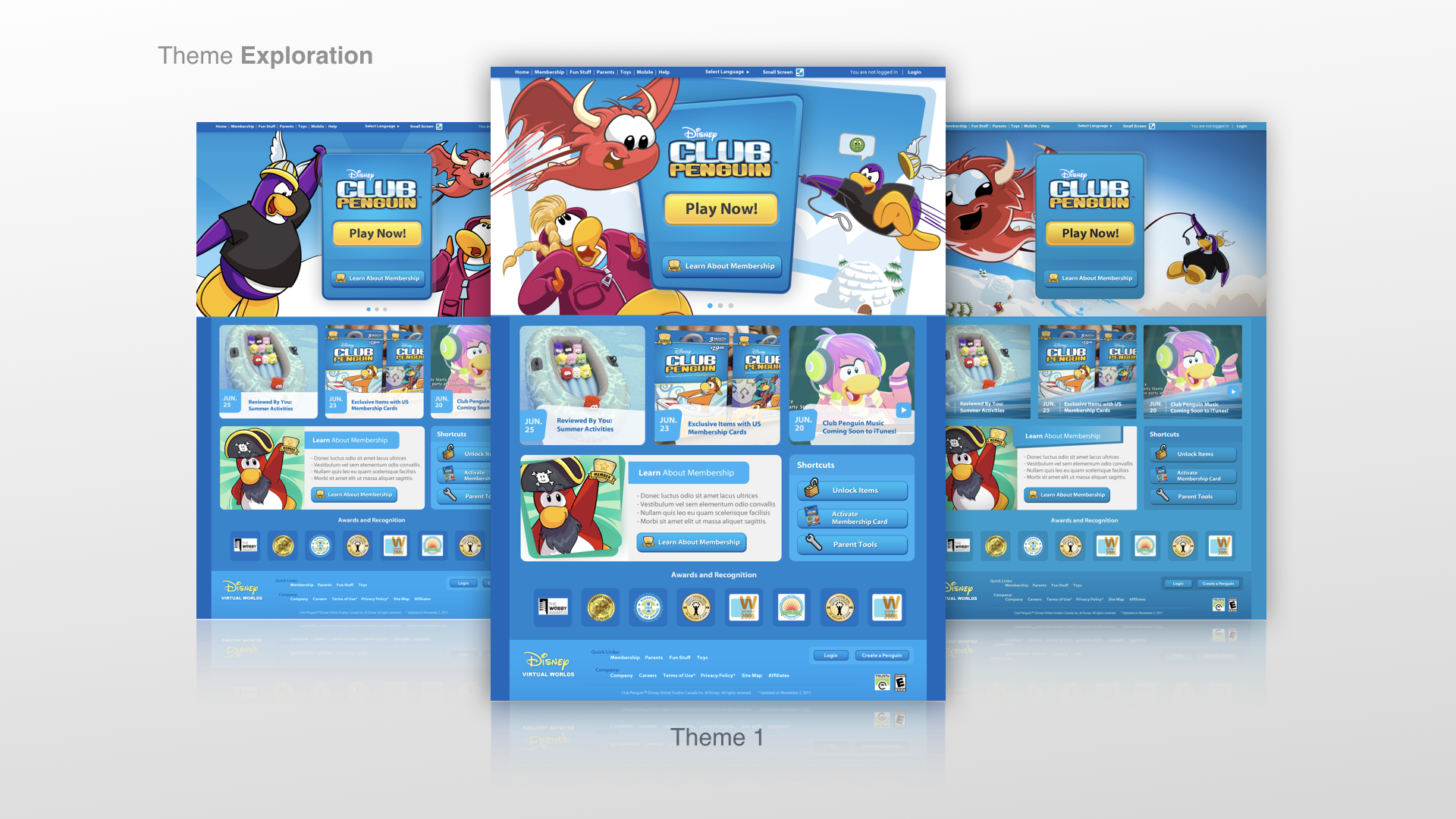
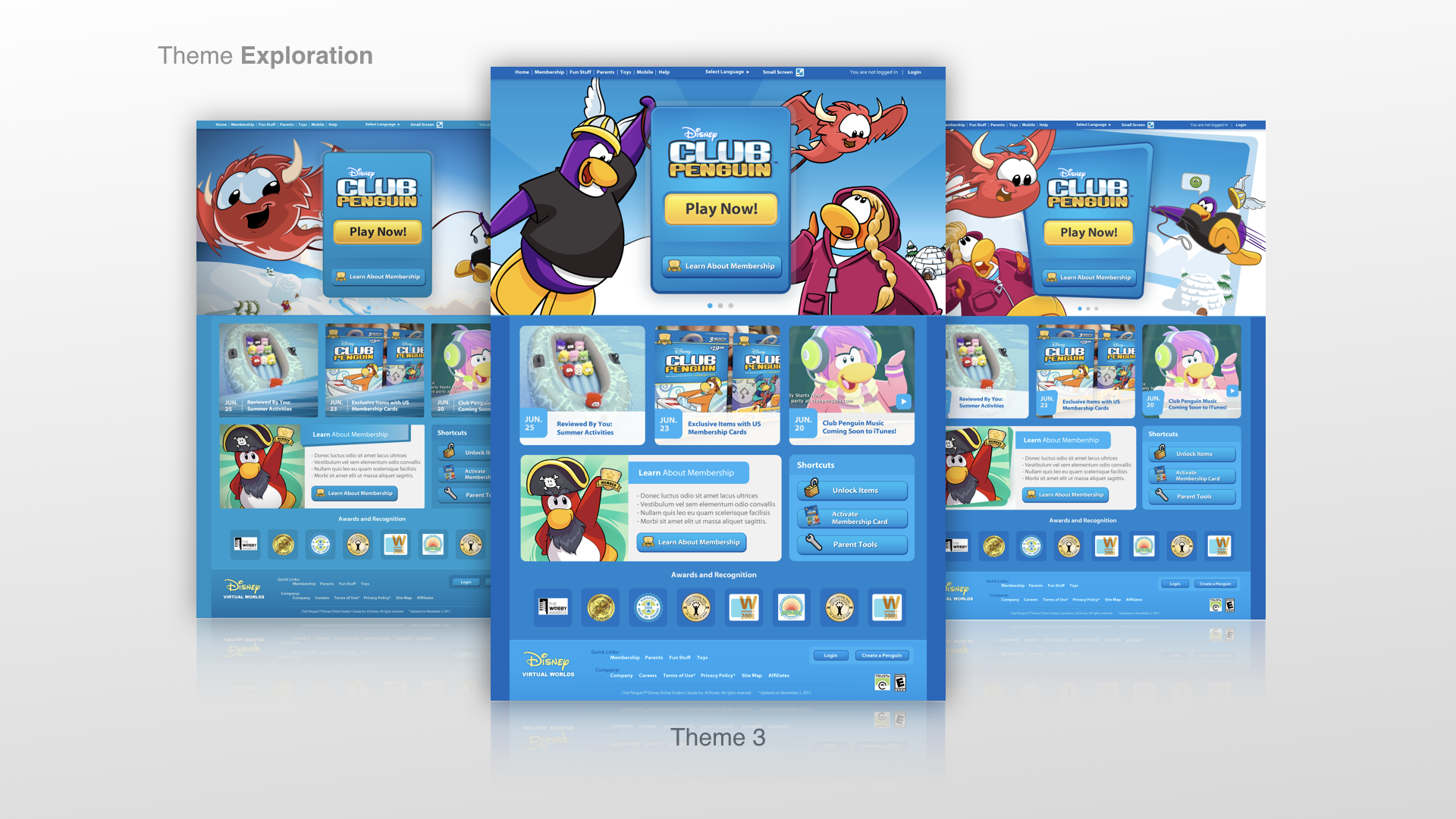
The Club Penguin branding colors were changing as we progressed through our redesign process. We had to be sensitive to all the users who were using this site everyday because they were emotionally attached to the characters, the story and the colors. While we kept the colors very similar, the characters and illustration styles began to evolve and "age" with the brand. For user testing of the homepage I created:
Three sets of UI design to test with the kids:
Traditional - this UI design followed very closely to the original brand design for Club Penguin
Comic - this UI design followed the new "aged up" illustration style of Club Penguin. Fun lines were used to convey movement and to be cohesive with new style of illustration.
Epic - this UI design is a level up from the "aged up" illustration style and the intent is to feel less comic styles and lean more into the mood of movies and theater.

User Testing Results - Homepage Redesign


The Neilson Norman Group
Buy a Membership and Create an Account
For the Buy a Membership feature and the Create an Account feature, we were tasked to work with the Neilson Norman Group in Seattle to conduct a three day study to uncover key challenges of those flows with parents who have children who use Club Penguin. The intent for this is to ensure that the value of membership is communicated clearly the parents and it's clear for them how to purchase one if they want to.
Experience Mapping - Create an Account

The Neilson Norman Group - Seattle User Testing
Along with the Lead Researcher Yoni K., the Lead Writer Emma B. and the User Research facilitator from Neilson Norman that we met in Seattle. For three days we conducted user interviews on the two flows.
Value of Membership Was Unclear
We learned that the value of membership is not made clear to the parents. Parents also liked hearing feedback from other parents and their experiences. We added these to the quick mockups below during our research sessions.


What is the meaning of the word, "Membership"?
We were curious if it was the word, "membership" the deterred parents from buying a membership. Along with the Lead Writer Emma we tried out different words with participants.
View of a draft design
We used this during research for brainstorming words for a free account versus a paid account.
Discovered a Missed Opportunity to Buy a Membership in Parent Confirmation Screen
We noticed that we didn't have a place for parents to buy a membership from the parent confirmation screen that is a mandatory click through from a confirmation email that we send to the parents, once the child creates an account. So, we added one and tested it with the parents.

We learned that parents still did not want to buy a membership without knowing what they would buy. So, the button on the last screen above, would take them to the Value of Membership where they can choose to buy membership.
Giving Choices
Parents liked having different tiers and knowing how much they would save if they enrolled in a longer plan. They also liked having a notification on which tier was the best deal.


Implementation of Research - UX and Visual Design
UX Flow - Buy a Membership

Wireframes - Buy a Membership


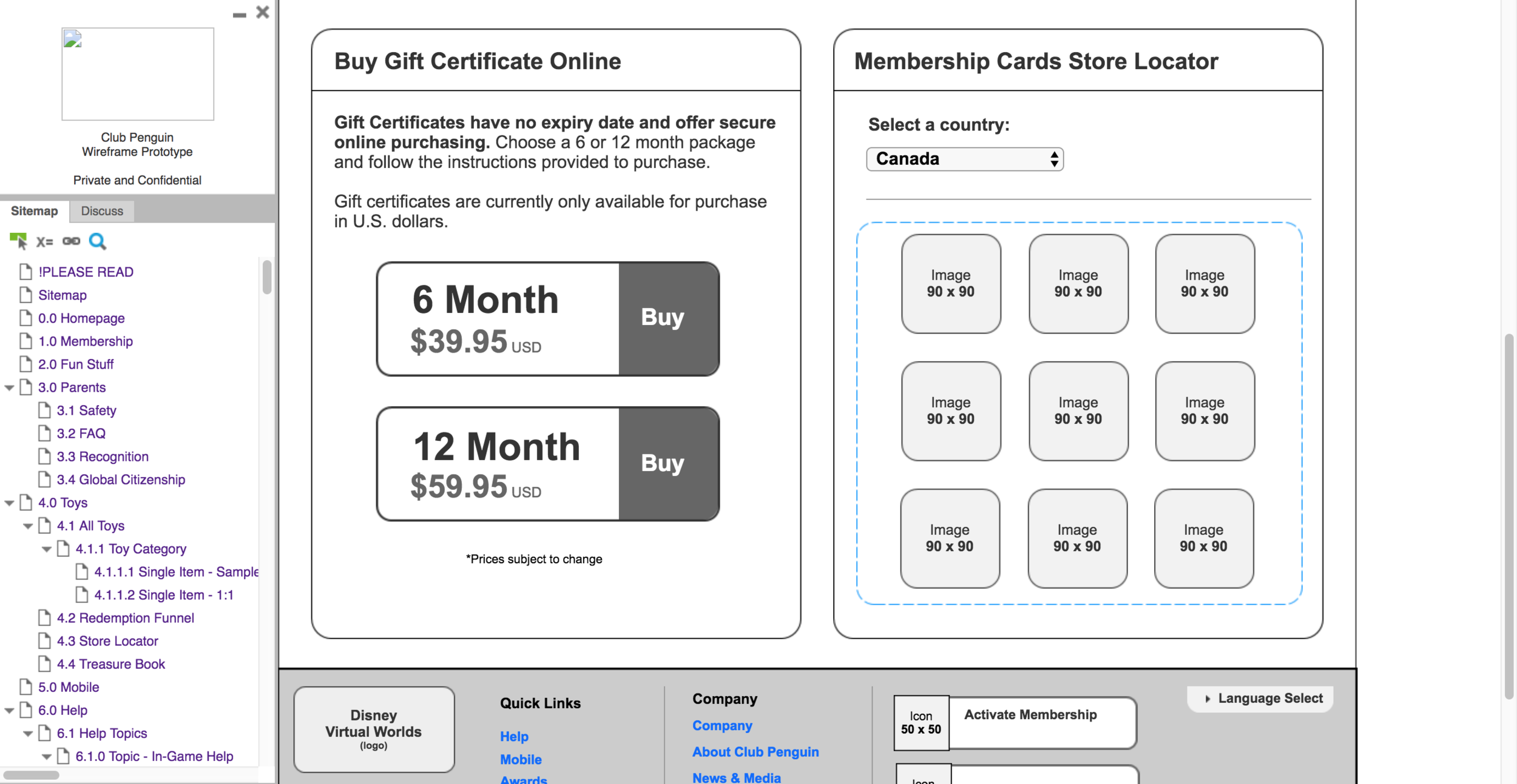
Visual Design - Buy a Membership


Upon launching the new Buy a Membership and Create an Account features, membership conversion increased by 23%.